Ongezellig
IAZ and soft NAZ
New thread
ZWABAG
<< < … 74 75 76 77 78 79 80 81 82 83 84 … > >>
File:
1784505448775.jpeg
(200.0 KB, 894x919, IMG_2622.jpeg)

>go to zellig imageboard
>see some monkey has negrobumped year old threads again 4 replies omitted.
>see some monkey has negrobumped year old threads again 4 replies omitted.
>>112845
no he didn't. its nice to be able to look back on the sites history
no he didn't. its nice to be able to look back on the sites history
>>112829
As you see old threads that get bumped after a year or something like that are mostly good. Since the site is semi-dead, and we're a rotting corpse, someone gets bored so much that decides to necrobump an old thread which he found in the catalog or remembered from his oldfaggot head.
As you see old threads that get bumped after a year or something like that are mostly good. Since the site is semi-dead, and we're a rotting corpse, someone gets bored so much that decides to necrobump an old thread which he found in the catalog or remembered from his oldfaggot head.
File:
1784505375738.mp4
(14.0 MB, 720x720, ze ik ben het maar english dub.mp4)
i, mayaGOD, made an english dub for Ik ben het Maar because I fucking hate ai (itz on der booru too)
98 replies omitted.
File:
1784505448775.png
(94.0 KB, 498x352, truthnuke.png)

File:
1784505448775.png
(760.0 KB, 1106x1221, 1760954020048z.png)

Hello all, as of recent I've been working on a fan made back story character, but I not sure how I should drop them.
I already have a nearly complete drawing of them but recently I got the idea of revealing them in a comic style piece.
My idea was the drop the character on the weekend, but I feel the comic could bring more "human" connection to them. And for obvious reasons this could take a long long time compared to the latter (1 - 2 weeks).
What do you guys think?
10 replies omitted.
>>112793
I am a t50 swarthoid my skin is the color of wet cement
I am a t50 swarthoid my skin is the color of wet cement
who is this backstory character and why am I supposed to care for xhem
File:
1784505448775.png
(40.0 KB, 341x498, IMG_2635.png)

File:
1784500506646.png
(610.0 KB, 6100x1700, mymyverse.png)

It's finally finished...
FINALLY 77 replies omitted.
FINALLY 77 replies omitted.
File:
1784500995792-1.png
(39.0 KB, 950x660, 2024-03-25_19-48-00.png)
File:
1784500995792-2.png
(56.0 KB, 1477x660, blahblahblah.png)
Is the improvement real?
File:
1784500995792.png
(75.0 KB, 600x800, emailglow.png)

>Is the improvement real?
File:
1784503394904.png
(640.0 KB, 819x921, 1711497898012-2.png)

is it just me or are there more tranaryans who browse the zarty?
40 replies omitted.
File:
1784503394904.png
(23.0 KB, 120x119, ClipboardImage.png)

A. FBBKBKBBB..B..BQ QQ494*($%&%%%%
File:
1784505448775.webp
(44.0 KB, 1282x1282, Yfke-PEEB.webp)

File:
1784498715883.png
(590.0 KB, 1000x1000, funne.png)

f
11 replies omitted.
File:
1784500724518.webm
(2.7 MB, 720x720, waffle.webm)
:^)
File:
1784505448775.mp3
(30.0 KB, hello-there-old-sport.mp3)
>>4909
Hello there, old sport.
Hello there, old sport.
File:
1784505448775.webp
(6.1 KB, 209x255, IMG_2044.webp)
>>112807
aryan game
aryan game
File:
1784500995792.png
(230.0 KB, 406x408, ClipboardImage.png)

Am I schizo or does the site actually feel semi-alive again?
2 replies omitted.
Probably refugees after the sharty became all cesspit filled with coal threads (the bluesky raid being the sole exception), making Zaryans more gemmy by default.
File:
1784500063584-1.jpeg
(130.0 KB, 1080x647, IMG_20240521_180848.jpg)

File:
1784500063584-2.jpeg
(56.0 KB, 1080x601, IMG_20240517_194417.jpg)
File:
1784500063584-3.jpeg
(120.0 KB, 836x487, IMG_20240521_215252.jpg)
Jesus Christ everywhere I go I see her
I cannot escape her
I AM GOING MAD I AM GOING MENTAL HELP
WHAT DID I DO TO GET MAYA TO HAUNT ME 23 replies omitted.
I cannot escape her
I AM GOING MAD I AM GOING MENTAL HELP
WHAT DID I DO TO GET MAYA TO HAUNT ME 23 replies omitted.
>associates a common piece of clothing with xis 16 year old WAIFU UOOOOO
kek, do waifufaggers really? oh not like this waifunigger, not like this!
kek, do waifufaggers really? oh not like this waifunigger, not like this!
File:
1784500063584-1.png
(43.0 KB, 720x240, b.php (2).png)

File:
1784500063584-2.png
(40.0 KB, 1183x1251, 1715726004474.png)
File:
1784500063584-3.png
(32.0 KB, 842x1075, 1715634298545-0.png)
Mymy and Chud thread
1 replies omitted.
File:
1784505448775.png
(290.0 KB, 983x1204, ClipboardImage.png)

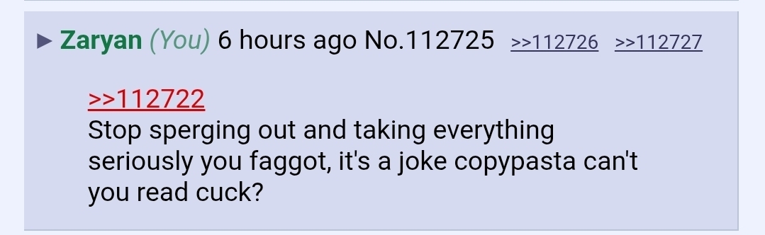
>Stop sperging out and taking everything seriously you faggot, it's a joke copypasta can't you read cuck? im dutch btw if that matters of zoiets
6 replies omitted.
File:
1784505448775.png
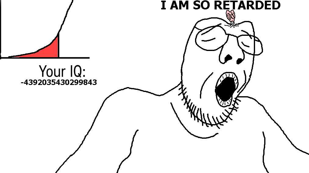
(37.0 KB, 1014x570, iq4.png)
File:
1784505448775.jpeg
(85.0 KB, 904x930, Mymy drink.png)

>>112751
Fuck you
Fuck you
File:
1784505448775.png
(430.0 KB, 814x832, 138164 - SoyBooru.png)

File:
1784505448775.jpeg
(93.0 KB, 1079x332, Screenshot_20251023_123504_Opera.jpg)
>>112728
I did this and say this
I did this and say this
File:
1784505448775-1.jpeg
(83.0 KB, 904x930, e.jpg)

File:
1784505448775-2.jpeg
(17.0 KB, 311x566, r.jpg)
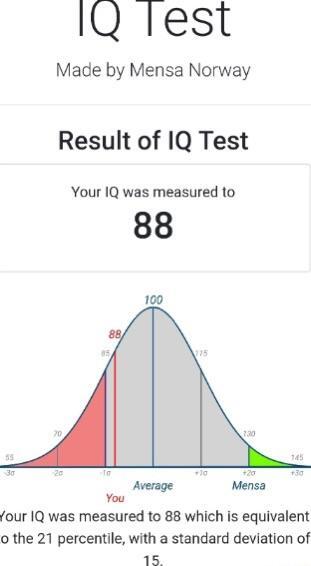
i ar too lo iq to capch solbve
7 replies omitted.
>>112671
I have gotten between 13 and 50 IQ in 109 tests, but it has never wuz my fault.
I have gotten between 13 and 50 IQ in 109 tests, but it has never wuz my fault.
File:
1784505448775.jpeg
(85.0 KB, 904x930, Mymy drink.png)
>>112658
Cocofails not like this
Cocofails not like this
File:
1784505448775.gif
(3.8 MB, 374x284, piratcy.gif)

if you're taking an Iq test on the internet... cheat!
File:
1784505448775-1.png
(64.0 KB, 500x250, ClipboardImage.png)
File:
1784505448775-2.png
(70.0 KB, 255x169, ClipboardImage.png)

>crunch munch munch munch
<crunch munch munch
<crunch munch munch
File:
1784505448775.gif
(440.0 KB, 220x220, IMG_2637.gif)

File:
1784505448775.png
(900.0 KB, 1000x1000, 140729 - SoyBooru.png)

something something maya won mymy lost
>inb4 Mymy_drink.png avatarfag 12 replies omitted.
>inb4 Mymy_drink.png avatarfag 12 replies omitted.
Stroopwaffel juice is the same as tomato juice. What a pervert would ever try them?
File:
1784505448775-1.jpeg
(85.0 KB, 904x930, Mymy drink.png)
File:
1784505448775-2.png
(67.0 KB, 1068x1093, Mymy smug.png)

File:
1784505448775.jpeg
(14.0 KB, 640x360, happy-maya-appreciation-post-v0-r8vagzlthx7e1.jpg)
Since we know Maya watches tranime, which ones do you think she watches?
17 replies omitted.
>>112607
aryan. i larp as both Light and L depending on the situation
aryan. i larp as both Light and L depending on the situation
Post actions
<< < … 74 75 76 77 78 79 80 81 82 83 84 … > >>