
The Zarty
ZOOOOOOOOOOOOOTTTTTTTTTTTTTTTTTTTTTTTTT!!!!!!!!!!!!!!!!!!!!!!!!!!!!!!
ZWABAG
[Return] [Thread list] [Index] [Catalog] [Bottom] | Replies: 11 | Views: 59 | Currently viewing: 1
File:
1784495449742-1.gif
(280.0 KB, 300x100, banner1.gif)
File:
1784495449742-2.gif
(290.0 KB, 300x100, banner2.gif)
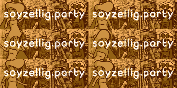
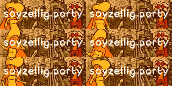
I couldn't decide whether I wanted some color on the two or leave it all monochrome, so pick whichever looks best (or tell me what to change to make it look better)
>>1451
agree, more vibrant and still fit with the warm tones, they blend in too much in the second one
agree, more vibrant and still fit with the warm tones, they blend in too much in the second one
File:
1784495449742.gif
(50.0 KB, 254x255, 1708107806957.gif)

god this is so gemmy
File:
1784495449742.gif
(1.2 MB, 640x402, both-is-good-both.gif)
Why not both?
File:
1784495449742-1.gif
(2.1 MB, 1500x500, banner1large.gif)
File:
1784495449742-2.gif
(2.2 MB, 1500x500, banner2large.gif)
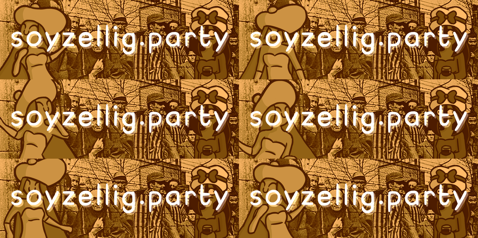
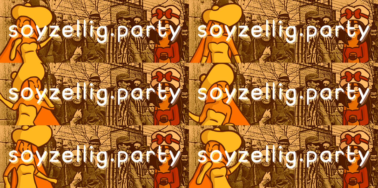
Here they are in higher quality, I wasn't sure if you needed them like this since IB banners had to be ~300x100 from what I've read.
>>1497
The ratio should be 3x1, so these should work. Thanks!
The ratio should be 3x1, so these should work. Thanks!
Post actions
[Return] [Thread list] [Index] [Catalog] [Top] | Replies: 11 | Views: 59 | Currently viewing: 1